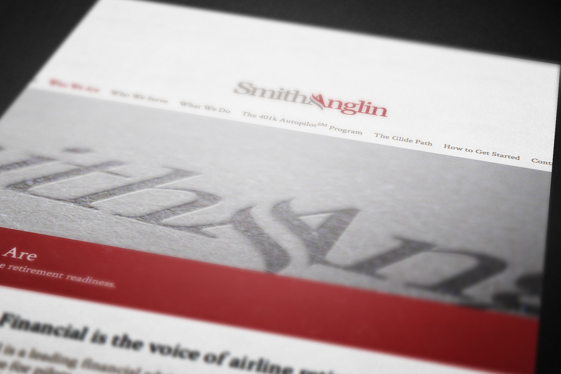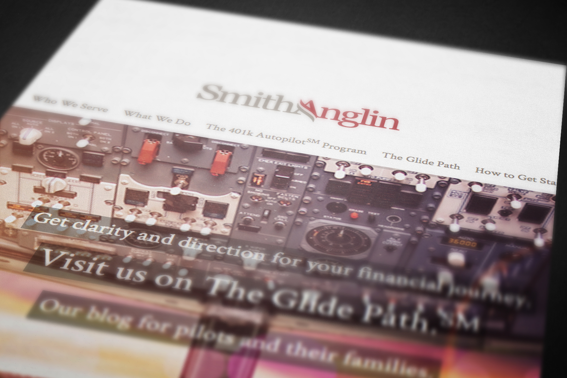
A brand identity takes flight.
Taking our cues from the commercial aviation industry, we designed a logo that at once feels familiar and engaging to airline professionals. The focal point of the logo is the curved crossbar of the “A” in Anglin, designed to suggest wings or airflow. The blending of gray into red represents a pilot’s transition from active service to retirement.